Infographics in the Classroom

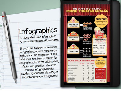
I’m going to start this post by admitting that I absolutely love infographics! I find them more engaging than paragraphs of text and I love seeing the information visually displayed in an aesthetic manner, which is interesting because I don’t consider myself a visual learner. If you aren’t familiar with infographics here is an explanatory image:
 |
| Image Credit: Infographics. (2013). CC-BY-SA. http://infographicsineducation.wikispaces.com/
I believe that, likes memes and trending YouTube videos, infographics can be a great way of presenting information through a platform that students are familiar with. One only needs to type in the word, “Infographic” into Google to see just how popular they have become (43,100,000 results to be exact).
 While I must admit that I haven’t used infographics yet during my student teaching placements I have been trying to brainstorm some different ways they could be used in the classroom.
Differentiating Instruction
In the most general sense, infographics can be a great tool to use in order to differentiate instruction in your classroom. By including textual information, diagrams and images they can effectively meet the needs of both linguistic and visual learners. Furthermore, the text that is included is often written at a simpler reading level than standard formal text on the same subject. As such, infographics can be an easy way to present information to students who are experiencing difficulties when it comes to literacy skills. Depending on the graphic, information is sometimes visually displayed in order to show connections between different topics which can assist students in making connections between the concepts.
Activating Tool
Infographics can be a great activating tool to incorporate when introducing a new unit or a specific lesson. Most good quality infographics do a great job of answering an interesting question or summarizing a specific topic. For example, infographics may be titled Hurricane Irene: Overwhelming or Overblown or Anatomy of a Hurricane. The first immediately attracts interest to the topic and the second provides a good overview of the topic in general. Either type of infographic could be used to activate student’s prior knowledge, stimulate interest and/or provide a framework for future learning.
Create An Infographic Project
There are several online tools out there that allow users to create their own infographics (I discuss a few of these tools below). These could be used by students to create their own infographics as summative projects. Infographics require the creator to summarize information and pick out the most important concepts. As such, they require students to fully comprehend the subject, apply their knowledge, classify it appropriately, create diagrams and evaluate what information is the most important in order to get their point across. Students won’t even realize they are hitting all the levels of Bloom’s Taxonomy! Instead of writing a traditional paper on the “War of 1812’s Effects on Multiculturalism”, why not give students the option of creating a infographic on the same topic?
Appropriate Sourcing Example
A good quality infographic will provide referencing and a list of appropriate sources near the bottom of the image like this one on,”Is Twitter Hurting Your Grades?”. Many infographics, however, provide no references or provide general links that do not go to the specific information like this one on, “The Growth of Twitter“. Infographics can be a good example to showcase the importance of appropriate sourcing to ensure that copyright is maintained and information can be easily accessed by the audience.
________________________________________________________________
If you would like to learn more about infographics and the role that they can play in education there are several great resources out there that can help you out. Here are some that I’ve found useful:
Infographics in Education Wiki
– This wiki involves examples of awesome infographics, citations, infographic
generators, tutorials and more! It even includes rubrics and information on
how to use infographic projects with your students.
– This is one of the best infographic resources that I have found.
– This comprehensive Wiki was organized by Mary Frazier, the Integration
Technology Specialist for Buhler USD #313.
 |
Infographics for Librarians, Educators & Other Cools Geeks LiveBinder
– This LiveBinder features almost 200 pages about infographics including
general information, infographic sources, infographics organized by subject
and how to create original infographics.
– This LiveBinder was organized by Carolyn Starkey who has curated
several different LiveBinders on library-related topics.
– http://www.livebinders.com/play/play/143539


Infographics Archive: Education & Careers
– The Infographics Archive is an online library completely devoted to
infographics that can be searched by category. The “Education &
Careers” category features several pages of infographics that could
be used in the classroom.
– It can take a while to search through all the pages within this category
but there is also a general keyword search if you are looking for
something specific.
– http://www.infographicsarchive.com/category/education-careers/

Cybrary Man’s Education Websites Catalogue of Infographics
– I’ve mentioned Cybrary Man on my blog before and if you are not
familiar with his catalogue, it features over 20,000 educational online
resources. His infographics page includes information on using
infographics in the classroom, lots of links to interesting and educational
infographics from various hosts.
– http://cybraryman.com/infographics.html

Good. Infographics
– The Good website has a complete section devoted to infographics which
users can search through. I’ve actually featured some of Good’s infographics
before on my blog and admit that they have some very interesting ones on
their site.
– Unfortunately I find their website hard to navigate so it may be difficult to
find infographics on specific subjects.
– http://www.good.is/infographics

JPL Infographics
– Jet Propulsion Laboratory from the NASA website has put together a
great collection of infographics on planets, parts of our solar system and
different NASA projects like different missions and rovers.
– Users can also create their OWN infographics using different information
and designs from the NASA website.
– http://www.jpl.nasa.gov/infographics/

Visual.ly
– Visual.ly is a fun infographic creation tool that allows users to create
infographics based off of information supplied through various social
media networks like Twitter, Facebook, and LinkedIn.
– Visual.ly also offers other infographic options for a cost but the free
ones are very interesting so far.
– I created an infographic comparing my twitter account to a fellow
education student’s!
– visual.ly

Intel: What About Me?
– The Intel website now has a tool that allows users to create a
personal infographic about themselves using information from
one of their social networking websites (Twitter, YouTube, etc).
– Its really neat to see a summary of all of your information and
they are very eye-catching!
– http://www.intel.com/content/www/us/en/what-about-me/what-about-me.html

Easel.ly Infographics
– Everyone loves infographics and easel.ly gives users the options to create their own!
The drag and drop option is really easy to use but because it is still in beta-form
and there are not a lot of provided options. Luckily, users have the option to upload
their own images which allows for full customization!
– http://www.easel.ly/
OOOH! Thanks for all these things to check out. I agree that these could be great for summative projects AND engaging for reluctant readers.
The biggest infographics directory: infographicsdirectory.blogspot.com/
Submit and promote your infographics for free!
Also kids can use creately like diagram software to create infographic online. that way they can learn and have fun at the same time.